WebsiteHunt is broughtBrought to you by Redact Everything
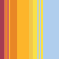
Air Quality Stripes
Visualizing air pollution trends globally
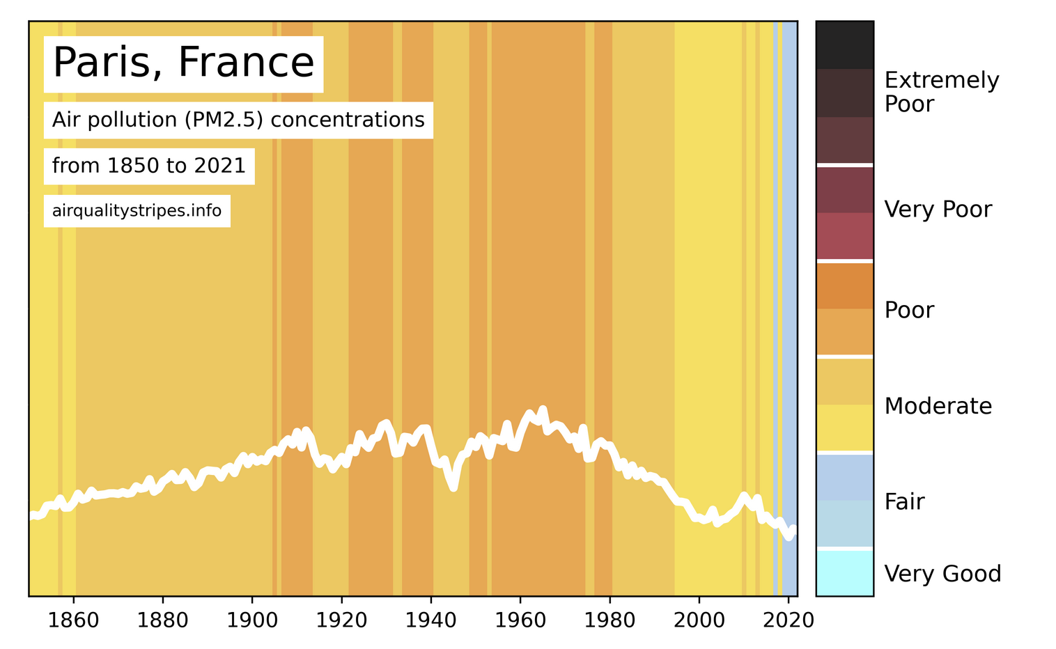
Air Quality Stripes provides visual representations of particulate matter (PM2.5) air pollution trends from 1850 to 2021 in cities worldwide. The stripes illustrate changes in air quality, highlighting improvements and ongoing challenges in reducing pollution levels. The data combines climate model outputs with satellite observations, aiming to raise awareness about air quality issues and their impact on health.
Comments
Loading comments...
Category
You might also like
HiAPI
One API for leading AI image, video, and text generation models. ✨ Premium
Amply Health
Live Well, Live Amply 🌱 Sponsored

TF
Time Flies - Koen van Gilst
A visualization of the passage of time using flies.
Roometron
Floor plans visualization
The Atlas of Economic Complexity
Visualize global trade data and economic growth opportunities.Sky Renderer
Visualize the current sky at your location
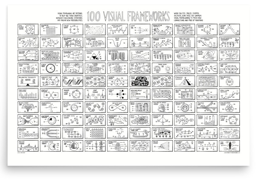
Visual Frameworks
Think creatively and visualize strategies and solutions
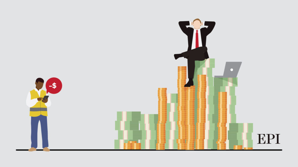
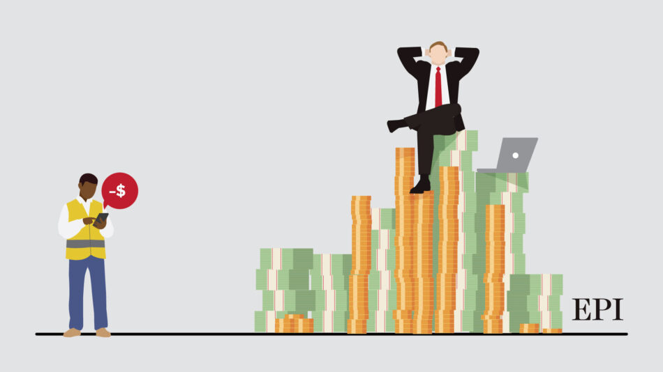
CEO Pay in 2023
Examining the trends in CEO compensation and inequality
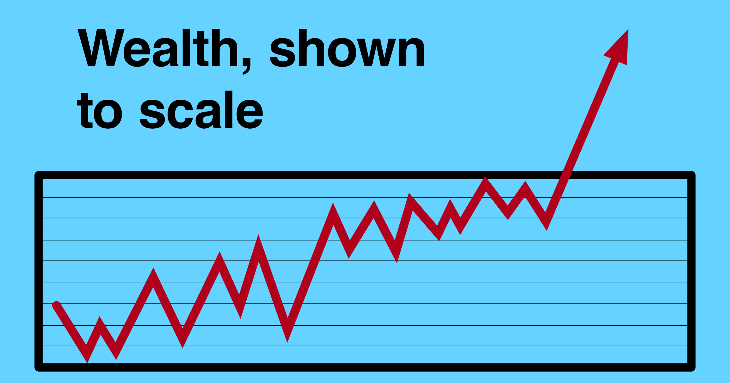
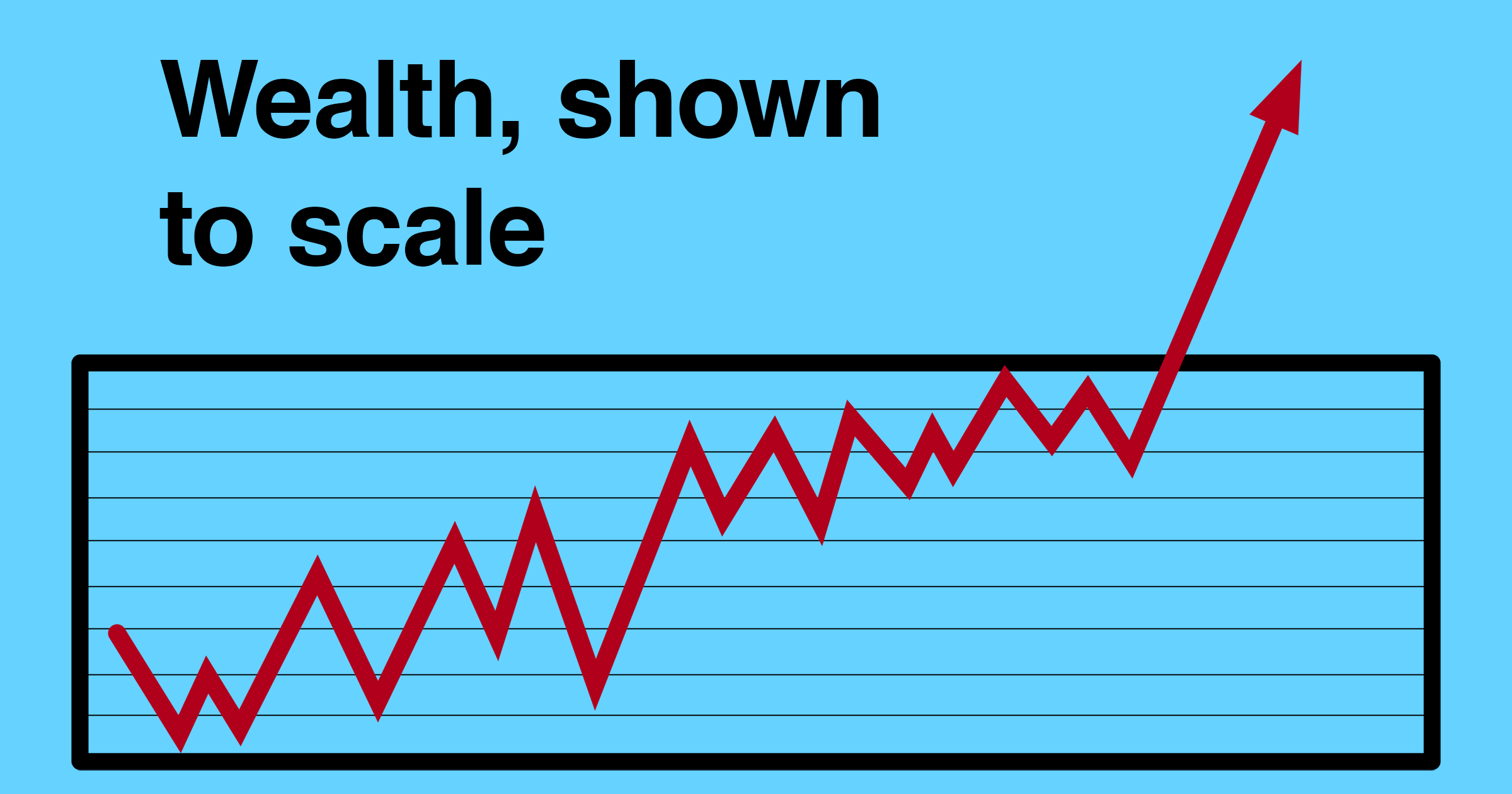
Wealth, Shown to Scale
Visualizing Inequality in the United States
Flourish
Powerful, beautiful, easy data visualisationData Formulator
Create rich visualizations with AI
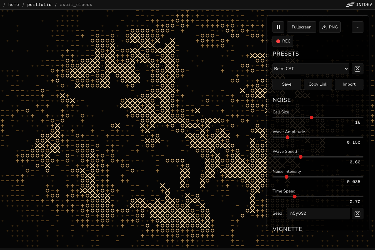
ASCII Clouds
Generative ASCII cloud visualization and art
AL
AI & Labor Market: Current State
Analyzing AI's effects on employment trends.
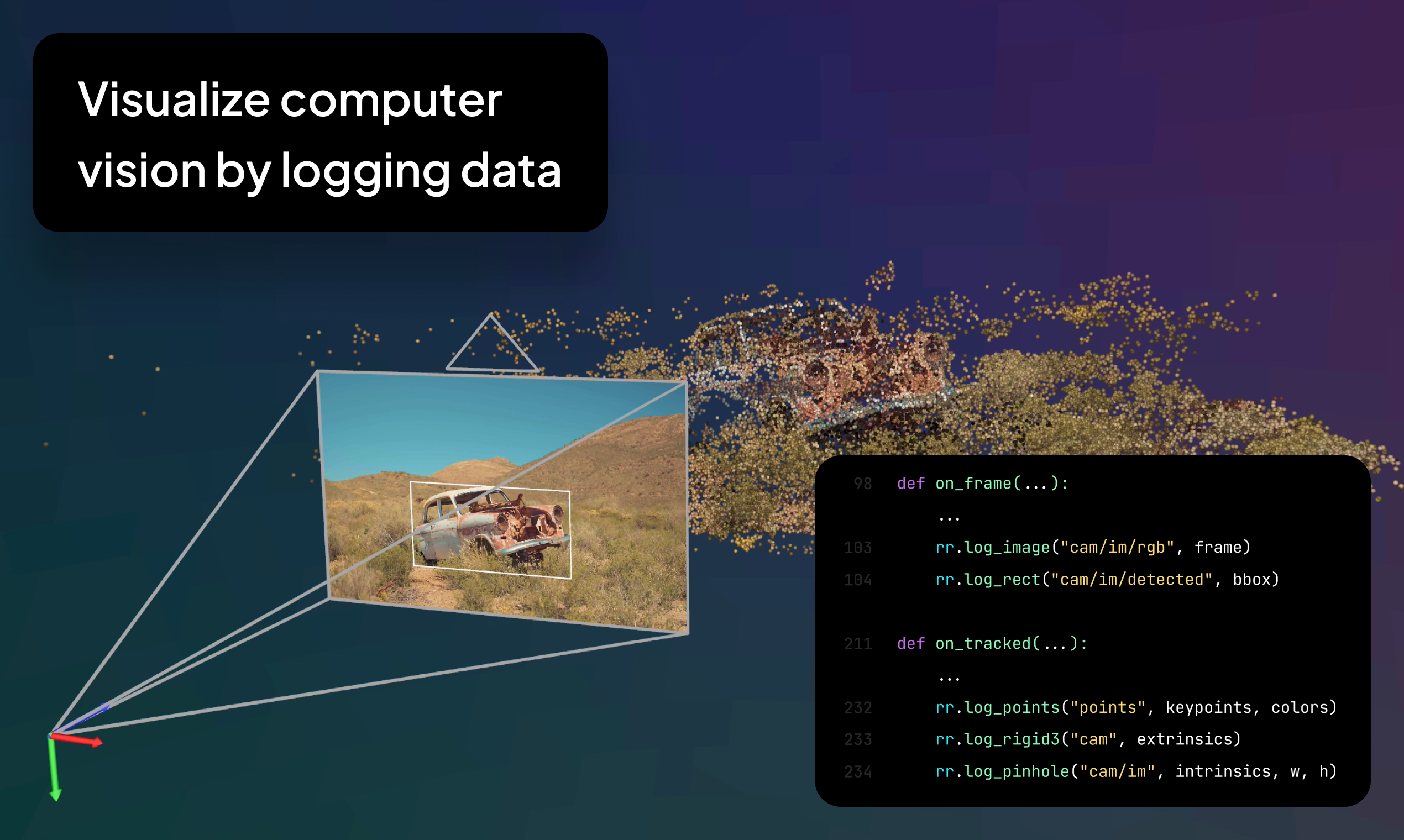
Rerun
Visualize computer vision
Azimutt
Simplifying Complex Databases, One Visualization at a Time
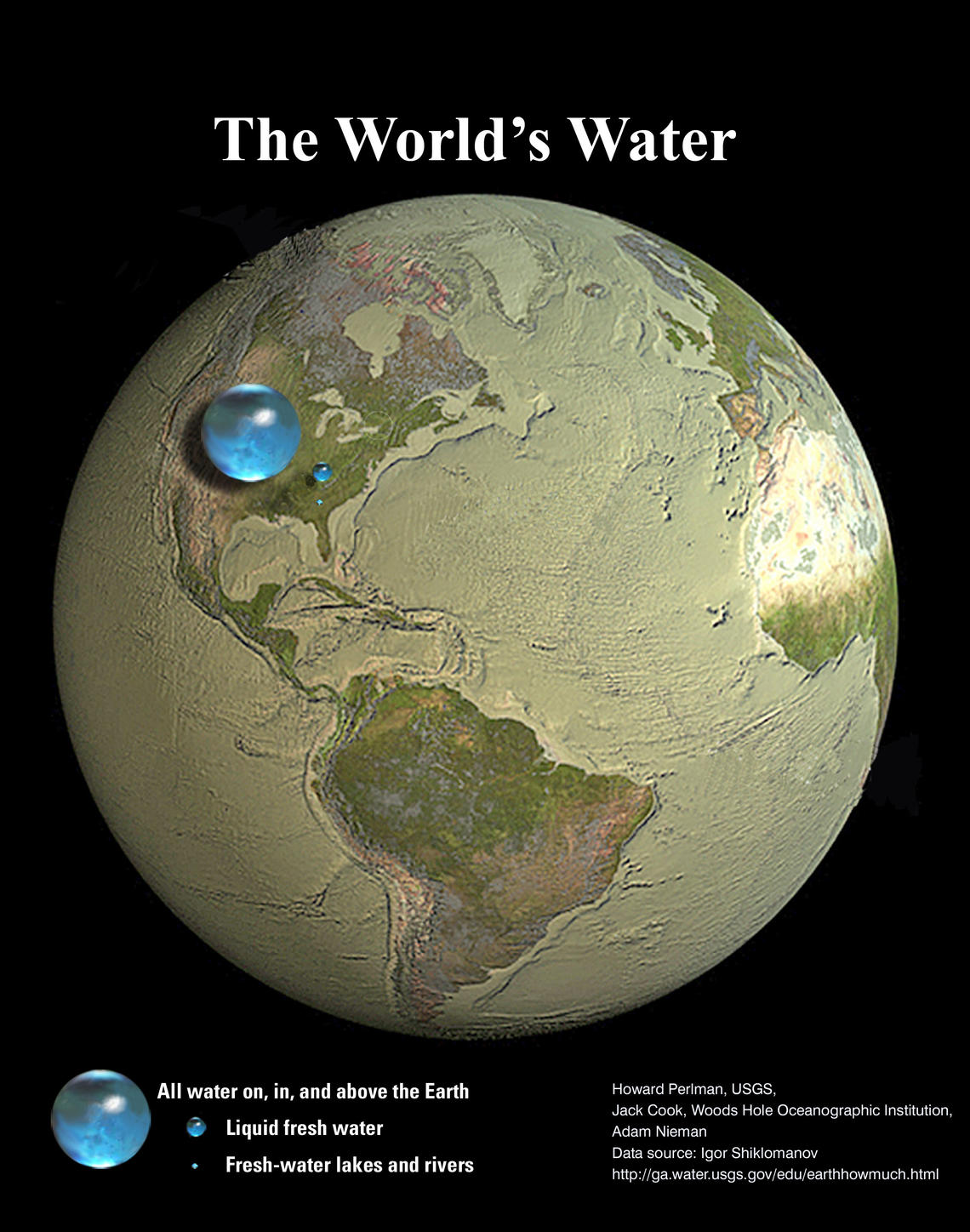
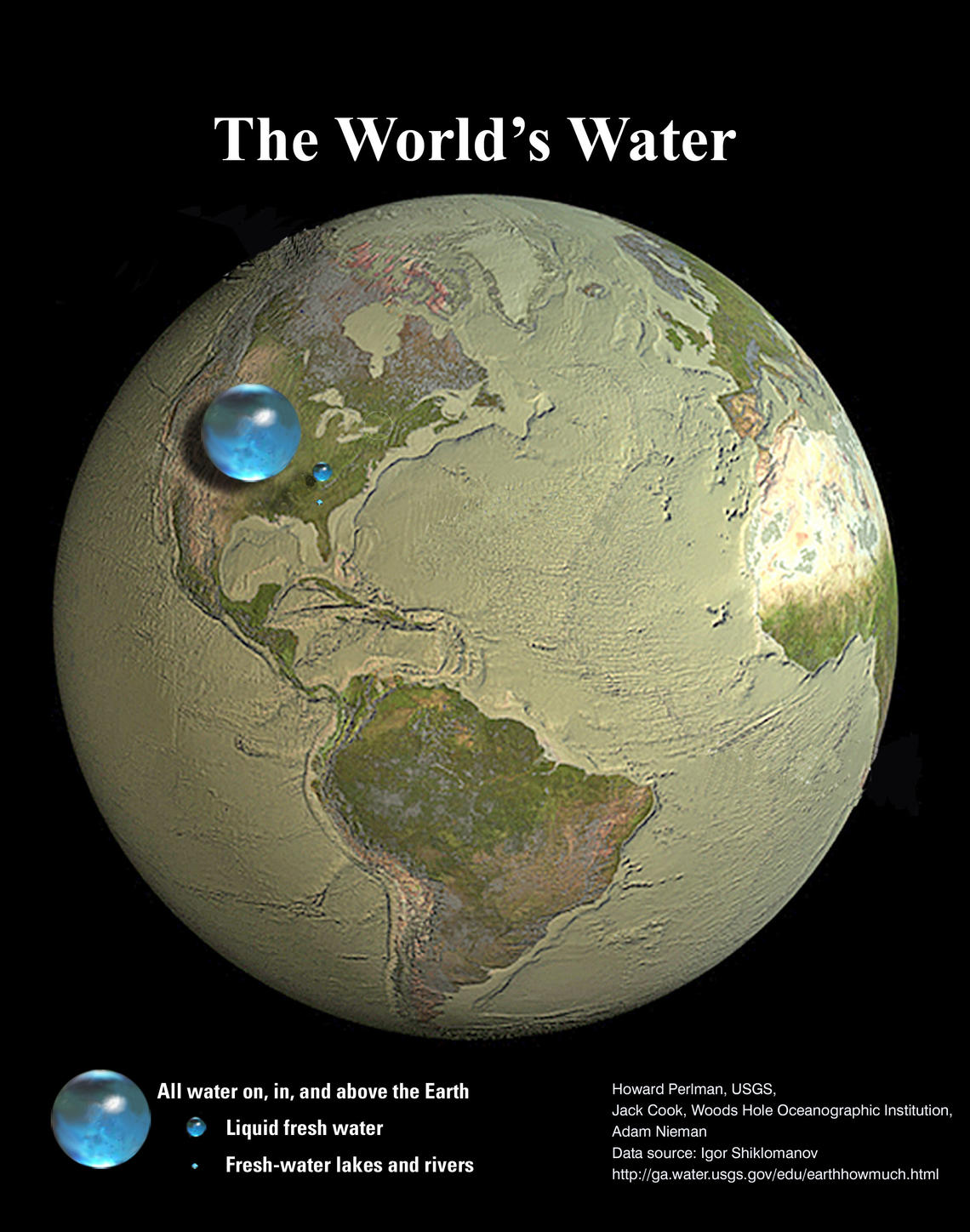
All of Earth's Water in a Sphere
Visualizing Earth's water in comparison to its size
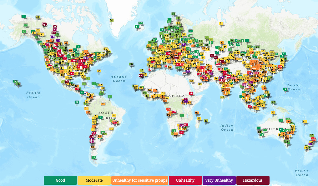
Air Pollution in World
Real-time Air Quality Index Visual Map
JSON Visio
Visualization tool for your JSON data.
Elite Remote Developers
Global Talent, Tailored Solutions
TM
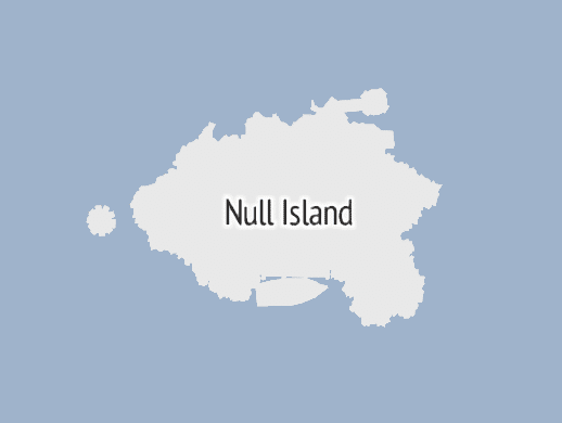
The Many Lives of Null Island
Exploring the quirks of cartography and data visualization.
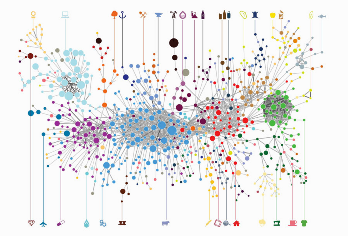
Sell! Sell! Sell!
A visualization of the most sold products around the world